MarkHolmes

Role /
UX / Visual Designer
Duration /
10 weeks
Year /
2019
Tools Used /
Adobe XD
Adobe Illustrator
After Effects
Draw io
Lookback
App Redesign For Libro.fm
It’s been 21 years since Tom Hanks (Joe Fox) and Meg Ryan (Kathleen Kelly) teamed up for the heartfelt rom-com You’ve Got Mail. Local bookstores like Kathleen Kelly’s still struggle to compete with larger corporations and their low competitive prices. Libro.fm is an audiobook company providing a way for local bookstores to remain competitive. Each time a listener buys an audiobook, a portion of the sale goes to their bookstore of choice. For this reason, bookstores love Libro.fm.
What was important to Kathleen Kelly's customers is true for listeners who choose Libro.fm. A sense of community through relationships, curated lists and raging against the machine keeps customers coming back.
The Problem: Bookstore owners and listeners complained the mobile app lacked crucial functionality (browsing, rewards, notifications, onboarding) compared to its desktop experience resulting in low retention. My team and I set out to provide listeners with a useful tool for browsing/listening to their audiobooks and fostering the relationship between listeners and bookstores.
My Role: For this 10-week capstone project, my team of three and I conducted research, user testing and designed concepts for an iOS mobile app. I provided strategy and guidance across the various phases as well as my visual design experience. We delivered the following:
-
Data from listener and bookstore surveys, bookstore interviews, competitive analysis, user reviews and secret shopping
-
Wireframe iterations
-
Hi-fi prototype
-
User testing insights
-
A list of priorities, recommendations and next-steps

Building a Foundation
To gain perspective, my team sent an assumptions survey to Libro.fm employees. I conducted a complete site audit, a competitive analysis of seven apps and compiled user reviews of common pain points and delightful moments. I used the insights from these methods to form constraints for future research and noted Libro's strengths that could migrate to the future design.

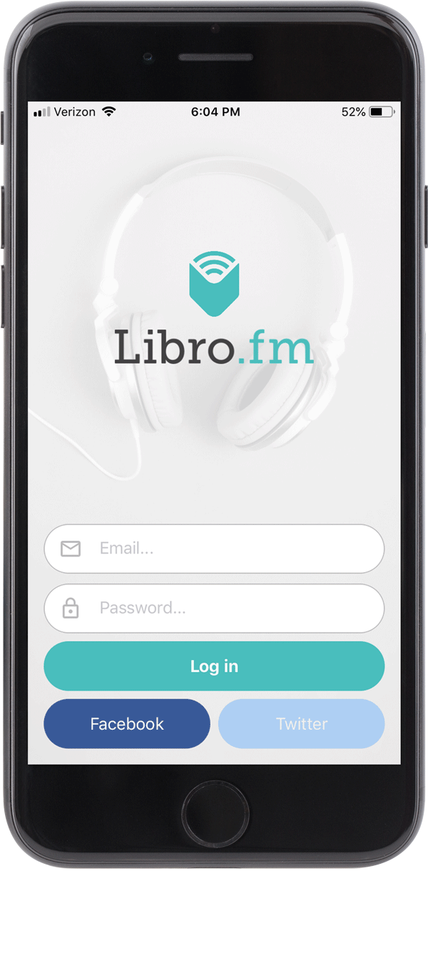
Original Libro.fm App
You’re Not Who You Say You Are
Following up on Libro's assumptions, a survey on audiobook listeners was conducted. The data provided three insights that shed light on a potential new user group.
The data showed listeners were:
-
In their 30's
-
Entrepreneurial
-
On-the-go
With this I was able to start forming some personas matched to behaviors and motivations.


Oh, There You Are
Peter (Aha)
It's important to me that I understood the bookstore owner's journey to build empathy. My gut was telling me there was missed opportunities with the bookstore employees given some pieced together information.
Through the assumptions survey I learned Libro acquires most audiobook listeners through referrals from bookstore employees.
The data collected collected in the bookstore survey showed employees were utilizing the platform less than 2-3 times a month.
Bookstore interviews revealed that owners’ and their employees’ time was very limited. They were, however, making time for a variety of social platforms, customer and employee communication and event planning. This proposed some questions:
How might we provide solutions to simplify the lives of bookstore owners and booksellers?
How can we separate Libro.fm from the flood of audiobook players?
I needed to provide solutions for bookstores to encourage them to create organic advocates for Libro.fm.
Build, Build, Build…
Test, Test, Test
Creating a matrix allowed me to prioritize features. On boarding and signup, purchasing, bookmarking and account/rewards were a few key functions with high priority based on all the data collected.
I built out user flows and a sitemap to better understand what screens to organize my workflow, visualize the user’s basic journey and create a mental checklist for an MVP.

Mapping User Features
Both listeners and bookstore employees use core functions of the app like listening and browsing. My solution for adding value to the bookstore was to partition bookstore accounts and provide extra menu features.

Starting The Conversation
Visualizing what the user is going to see and read – I can start a conversation between the product and its user. Through this process I learned what crucial information each user group needs to see in order to successfully onboard.


Research-driven
Design Goals
-
Design a simple way for users to browse and listen to audiobooks using familiar design patterns.
-
Provide visual cues that let users know which bookstore they support. (Data from Libro showed that users who select a bookstore to support, rather than support all bookstores, have a longer retention rate.)
-
Use audiobooks to educate on-the-go. I wanted to give users solutions to keep track of their ideas.
-
Provide features that let users customize/keep track of their owned books.
-
Create a value prop for booksellers to encourage more frequent usage of the app.

Make It Sparkle
To connect bookstores to their Libro.fm customers, I designed features that bookstores currently use in the tangible world – keeping a dichotomy that shoppers are familiar with.
Bookstore profiles, event listings, recommendations and reviews from booksellers and the ability to push notifications were designed to help alleviate the disparate toolset of the bookstore employees. Now there is a centralized location to do common marketing techniques.
Bookstore owners spend a large part of their day managing and communicating with employees. With the features built into the owner’s account, they can minimize their process. Libro.fm referral tracking, bookseller list approval, contact information, ability to disable bookseller accounts and communication features aim to simplify the bookstore owner’s life.


Multiple Touchpoints
Upon signing up, listeners are prompted to support their local bookstore. Location recognition provides them with the closest bookstore (likely the very bookstore they are standing in). The interaction of the bookstore’s logo minimizing into the menu shows users information can be found there.
Rewards connect the listener back to their local bookstore and aim to entice with gamification. As user’s browse for audiobooks they can easily navigate to the “Bookstore Recommended” tab to further that connection.
When a user launches Libro.fm after a purchase messaging shows them they are earning points and continuing to support their local bookstore.

Bookstore employees are also listeners. What better way to generate advocacy than to make them fans of broader features as well. To keep track of their ideas I designed an easy way to trim clips of audio and take notes with ease. User's have a centralized location for the ideas in an easily navigable list view. Entering into a title you can play individual clips, play all clips edit/add notes and jump back into the audiobook from the bookmarked position.
The Result
After presenting to the Libro.fm team and my team received positive feedback with our design execution.
“The work for Libro.fm went above and beyond our expectations. Not only was the work very polished and professional, but they really took the time to understand what Libro.fm is trying to achieve. The depth of their research was impressive, their questions were spot on, and their insights were invaluable.”
- Libro.fm
Key features Libro.fm was drawn to and will likely be included at app launch:
-
Micro interactions and motion
-
Landing Page
-
Enhanced Bookmarks (The note-taking/audio-clipping function)
-
Book Bag
-
Discover Page
-
Bookseller features (customer sign up, gamification of the rewards, training)

